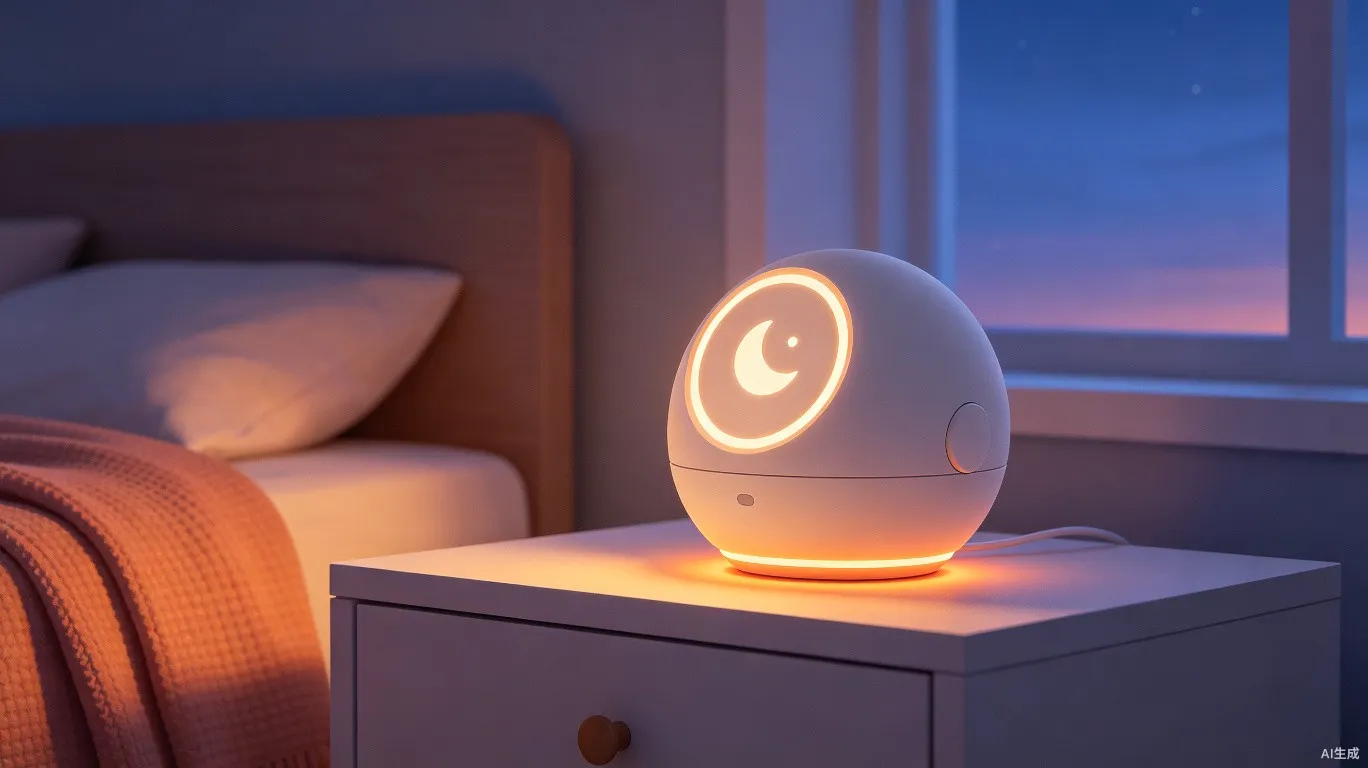
Starting from a sleep pain point, through design strategy, imagery research, form exploration and iterative reviews, we arrived at an "unconscious-use" smart sleep companion.
Alarm clocks are a well-defined yet under-innovated product category. Examining this "pillow-side" device, we found four key contradictions.
Core Insight:Nighttime usage is a "vacuum zone" for smart devices. Most smart devices focus on daytime use, leaving the bedroom scene largely underserved. Effectively integrating smart alarm clocks into nighttime life to meet sleep management needs is a key challenge to solve.
Many smart alarms are feature-rich, but users often only need basic alarm functions. Complex settings become a burden.
Voice recognition and smart interaction have improved, but misoperation and inaccuracy still affect user experience.
More brands enter the smart alarm market, with products highly convergent in appearance, features and content.
We positioned the product at the intersection of three dimensions: alarm clock reliability, bedside speaker content, and smartphone health monitoring. The core of all three is"Meditation & Sleep Detection"。
Focus on alarm/health features, enter market as a tool. Target penetration: 10%.
Introduce AI Bot and voice interaction (ASR). Content drives stickiness. Target penetration: 15%.
VLA Chat Bot + HER-level emotional interaction. Achieve large-scale social spread. Target penetration: 70%.
Design Strategy
We established three design pillars for Raychel that guide every decision from concept to production. Click the cards below to explore each strategy.
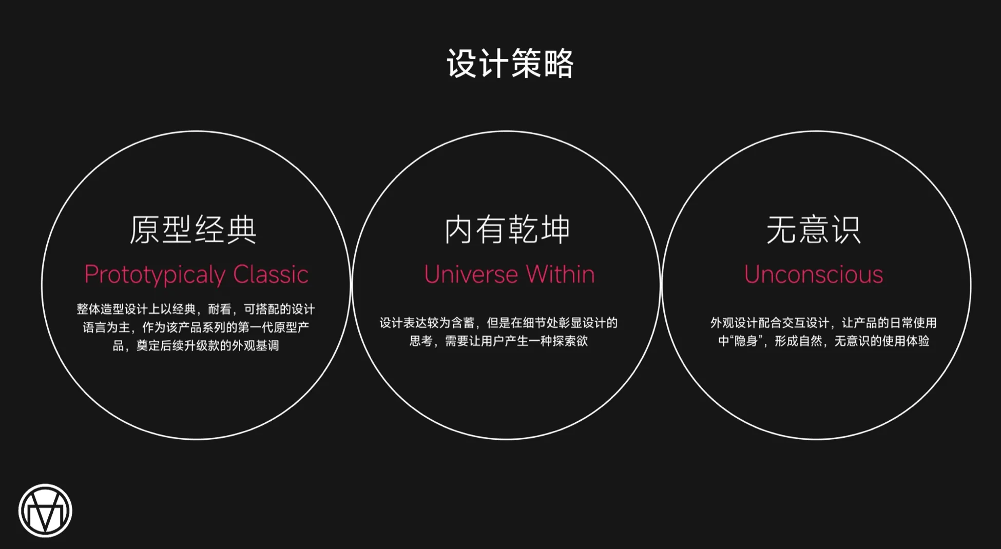 Prototypically Classic
Universe Within
Unconscious
Prototypically Classic
Universe Within
Unconscious
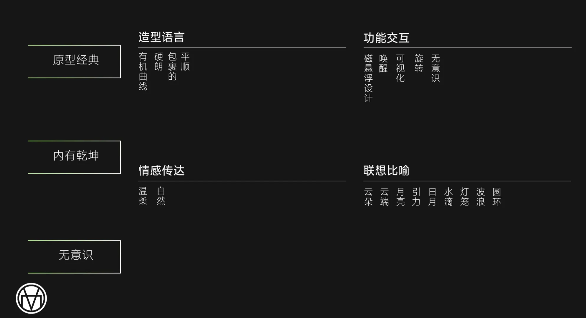 Prototypically Classic
Universe Within
Unconscious
Prototypically Classic
Universe Within
Unconscious
Through design, users should feel the product's meticulous care for their sleep. Details should invite discovery. The tone should convey "technology for good."
— Raychel Design GuidelineImagery & Emotion
In the early design phase, we built a comprehensive imagery mood board — from natural phenomena to interaction gestures — infusing the product with perceivable emotional DNA.
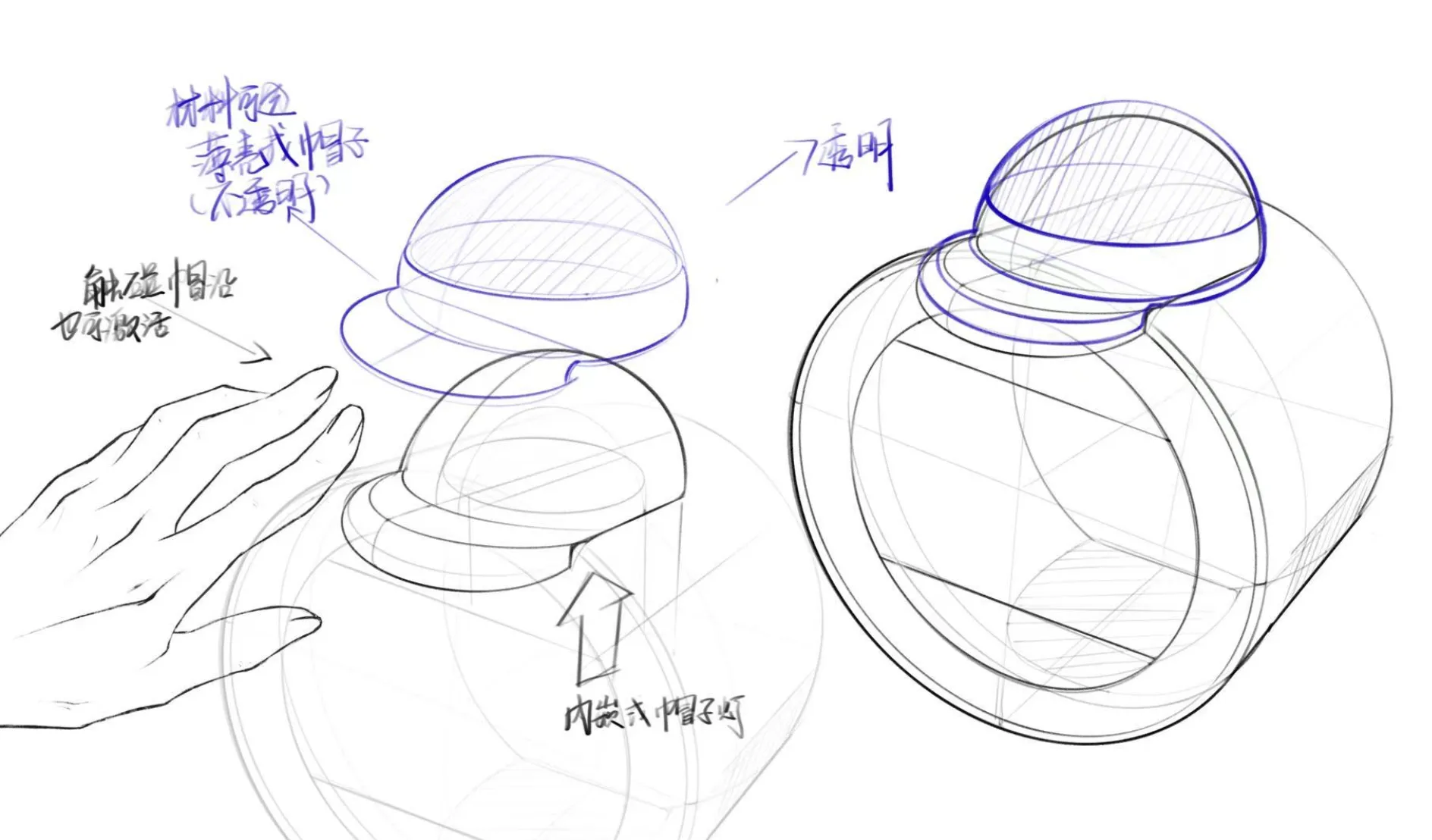
Imagery Keywords: Clouds · Moon · Gravity · Raindrops · Lanterns · Waves · Rings · Day-Night cycles. These natural phenomena form the poetic foundation of the design language — the product is not a cold electronic device, but a "night companion" with a breathing rhythm.
Fingers touch the product surface to activate functions, feeling a soft tactile feedback — like gently stroking a quiet companion.
Hand gestures rotate to adjust light color temperature and brightness. The product follows the user's movements via motion sensing, creating a natural dialogue.
Proximity sensors detect the user's approach and automatically turn on gentle lighting — no active operation needed. The product is already prepared for you.
The product "disappears" in daily use. Users don't need to learn any operation — the most natural approach, touch, and rotation completes all interactions.
At the behavioral design level, the product itself implies: before bed, shift your attention away from the screen. This is not a restriction — it's a gentle nudge.
Subtle vibration feedback like water ripples, combined with breathing training rhythms, guides the user from wakefulness to sleep.
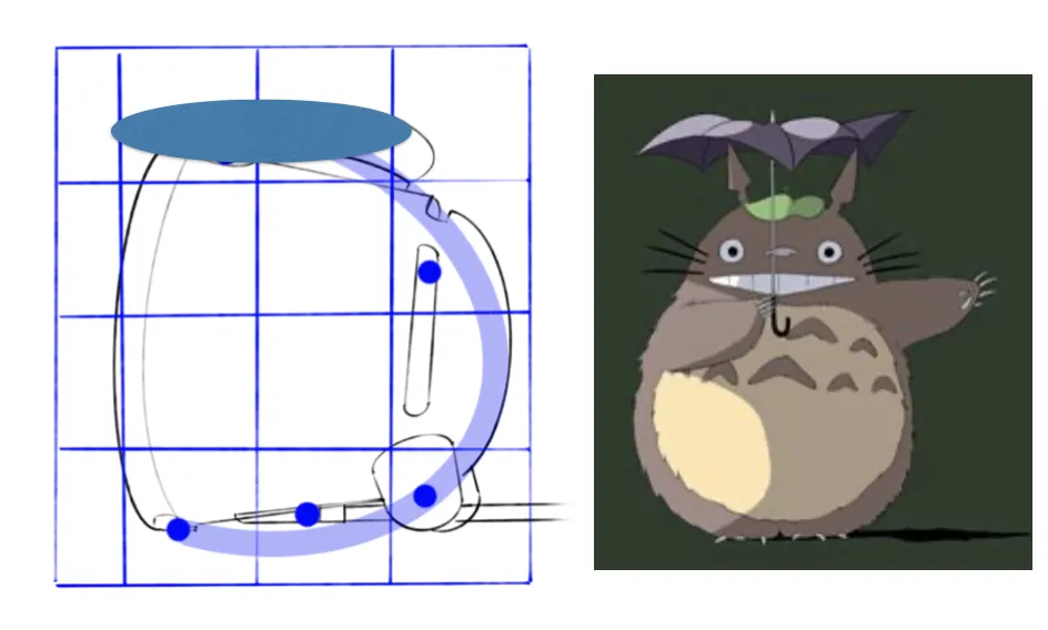
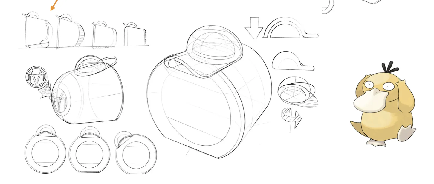
We extracted a "reassuring roundness" from classic animation characters, transforming Totoro's warmth and Psyduck's charm into the product's foundational form DNA. These are not surface-level IP licenses, but a deep emotional design methodology.
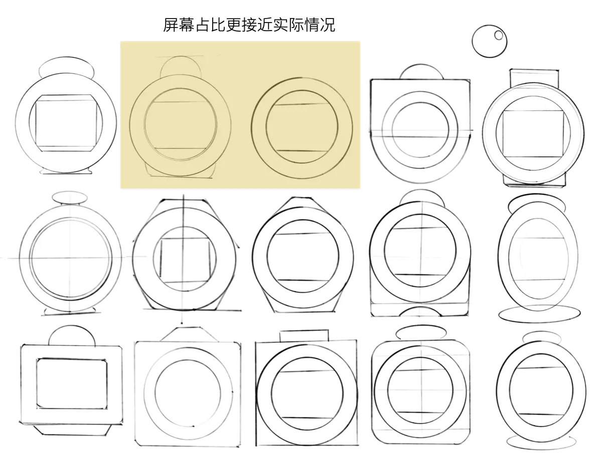
Form design doesn't happen in one step. It's an iterative process from broad exploration to gradual convergence, from geometric deduction to design review.
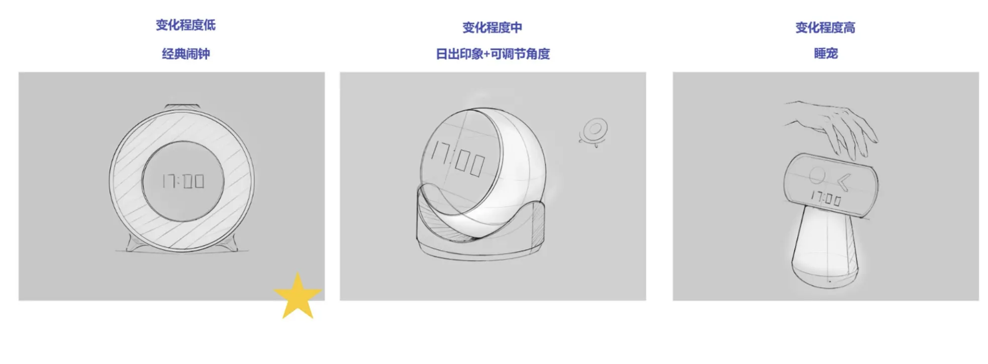
In the earliest exploration phase, we defined three degrees of change — from conservative classic alarm forms to bold "sleep pet" anthropomorphic designs.
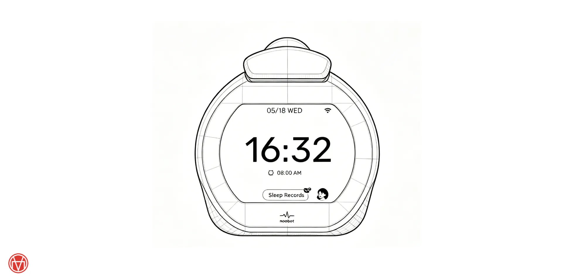
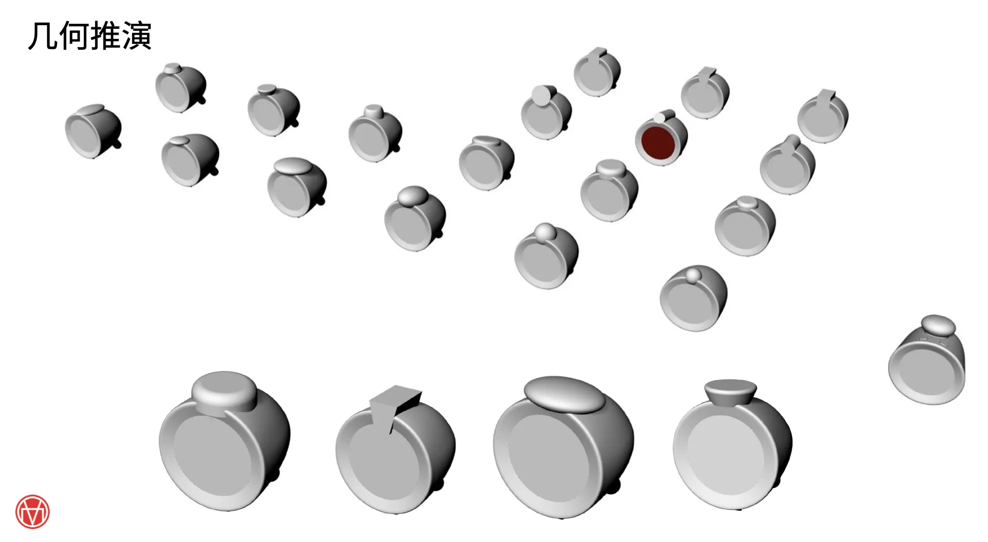
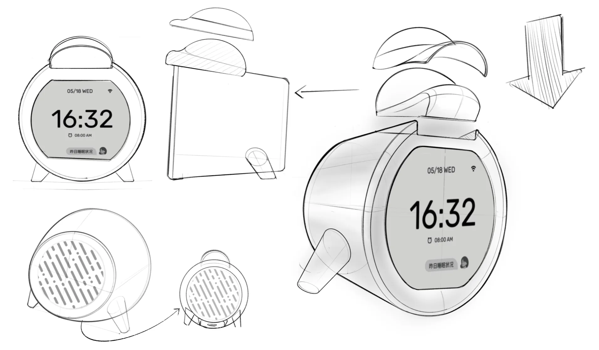
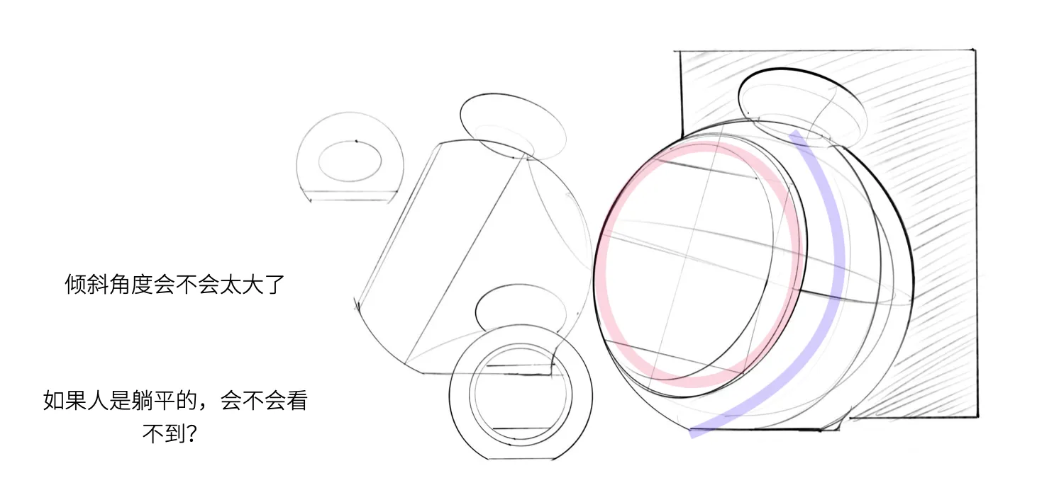
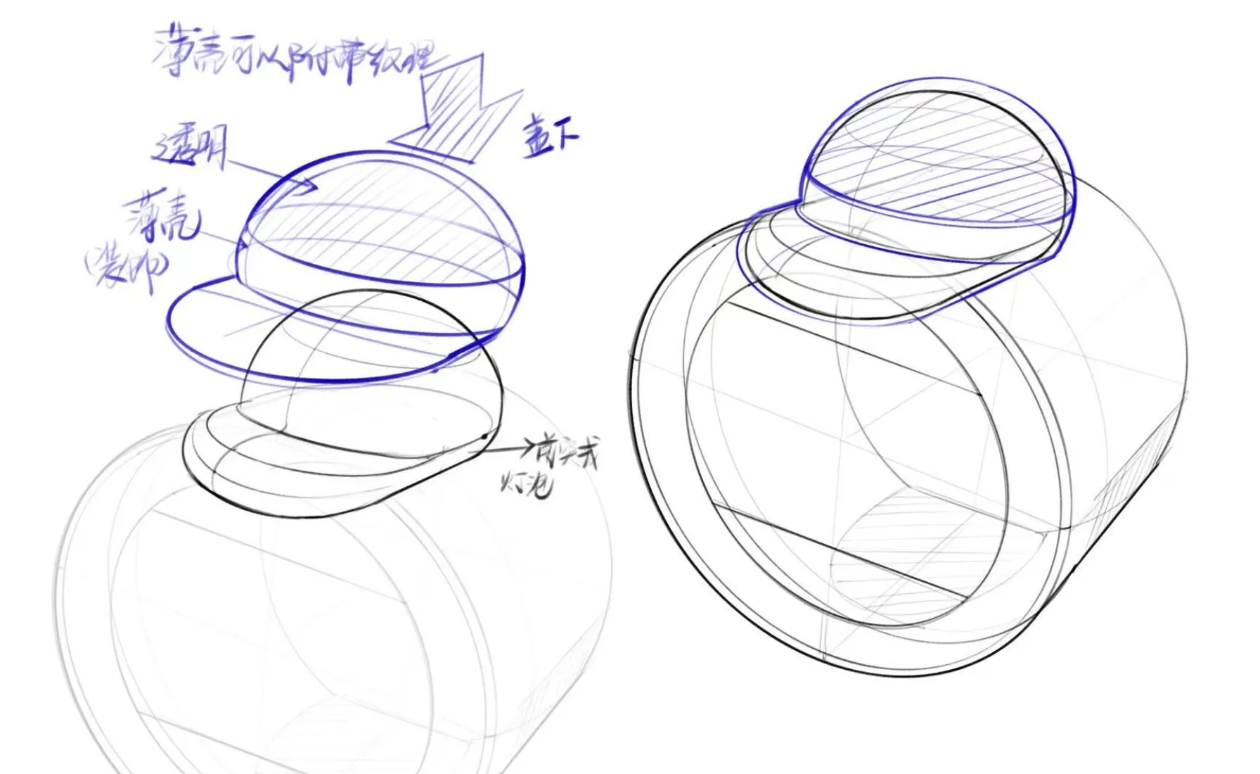
We studied the iMac G3's classic transparent material language and explored perfume bottle proportions. Each reference is not mere imitation, but an extraction of design philosophy essence.
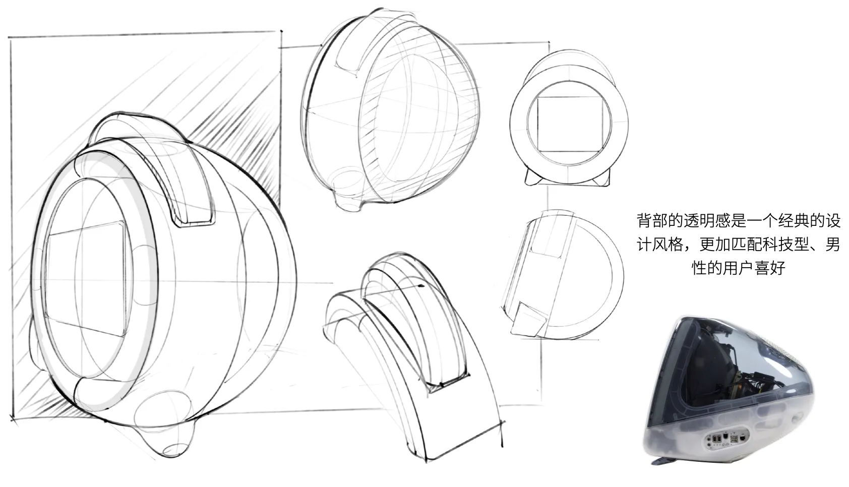
The transparent back is a classic design style, more suited for tech-oriented, male users. Exploring the possibility of visualizing internal structure.
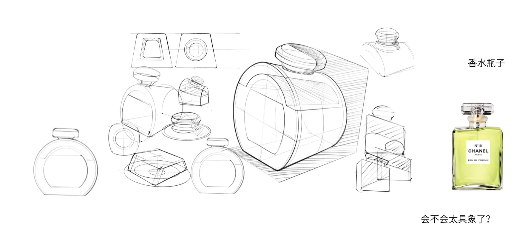
The core question of perfume bottle design: "Is it too literal?" — We constantly seek balance between concrete and abstract.
The stand approach directly affects the product's visual language and usage scenario. We systematically compared three solutions.
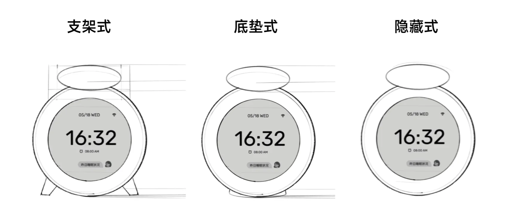
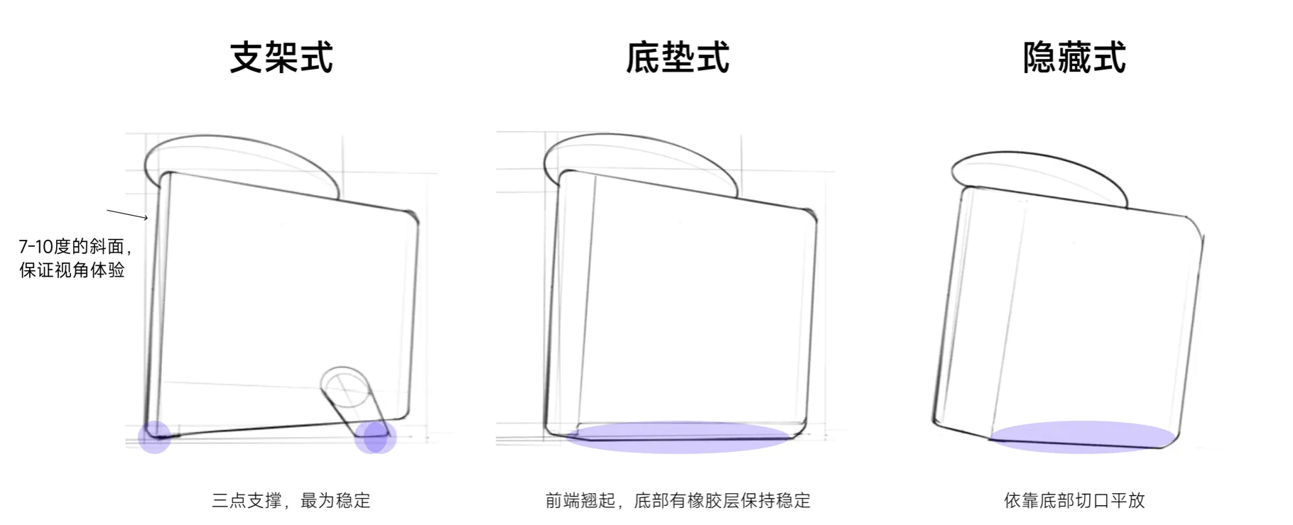
Key Decision: We chose the "Base Pad" solution — front raised 7-10°, rubber bottom layer for stability. Best viewing experience with the cleanest product silhouette.
Great design doesn't happen in one shot. It evolves through iterative reviews and criticism. Below are key review milestones and turning points.
The core criticism of the first review round pushed us to redefine "tech feel."
Lighting was elevated from a secondary feature to the core identity element.
A collision between design ideal and manufacturing reality. We accepted this constraint and compensated with surrounding form and lighting.
The most critical directional review. We chose the path of "effectively combining light, form, and function" — evolving the product from tool to companion.
An ergonomic challenge for the bedroom scenario. We resolved this with a 7-10° micro-tilt solution.
From "toolbox" to "memorable" — this isn't just a visual change, but a design philosophy transformation.
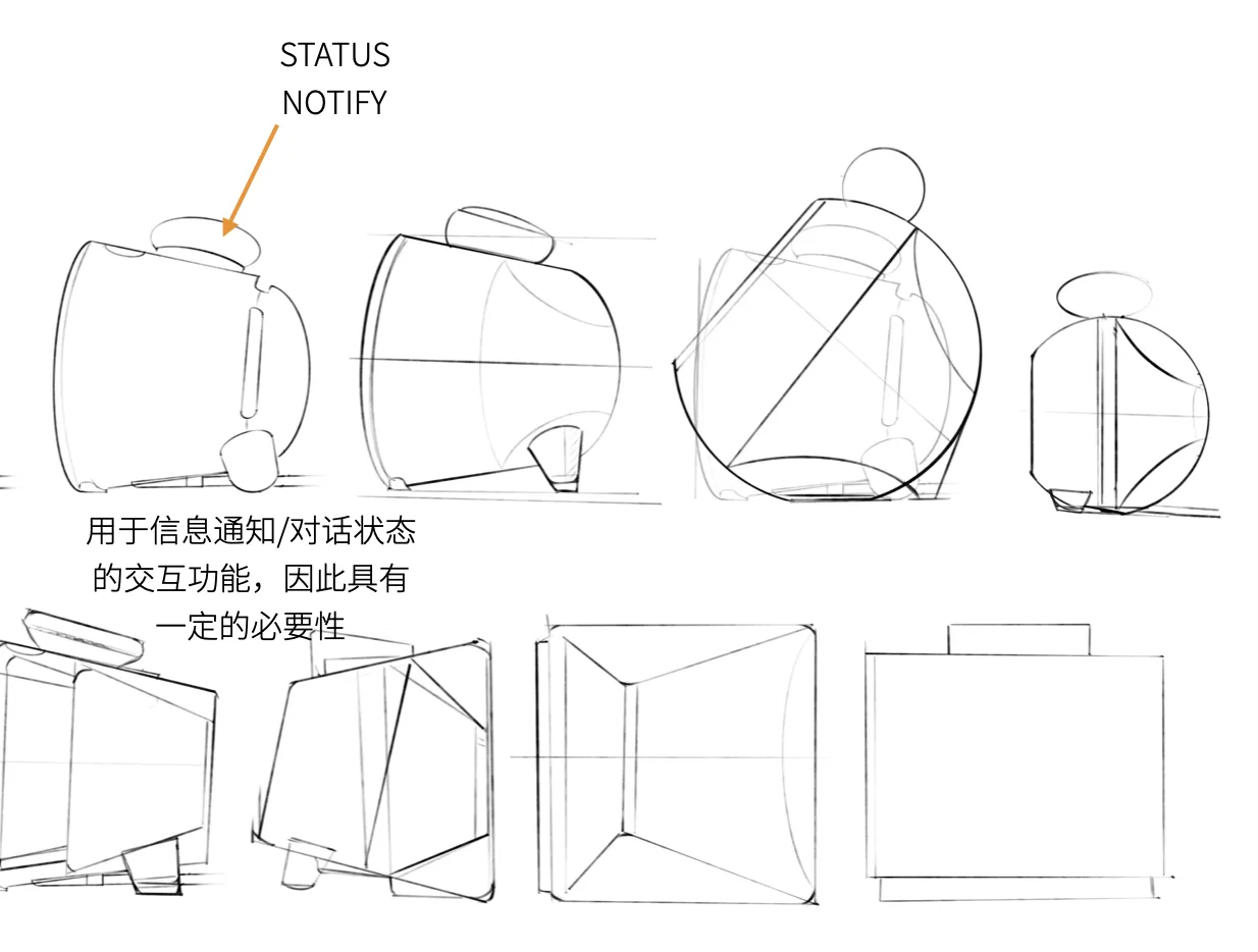
"The overall style lacks distinct memorable points; doesn't feel technological" — The early design
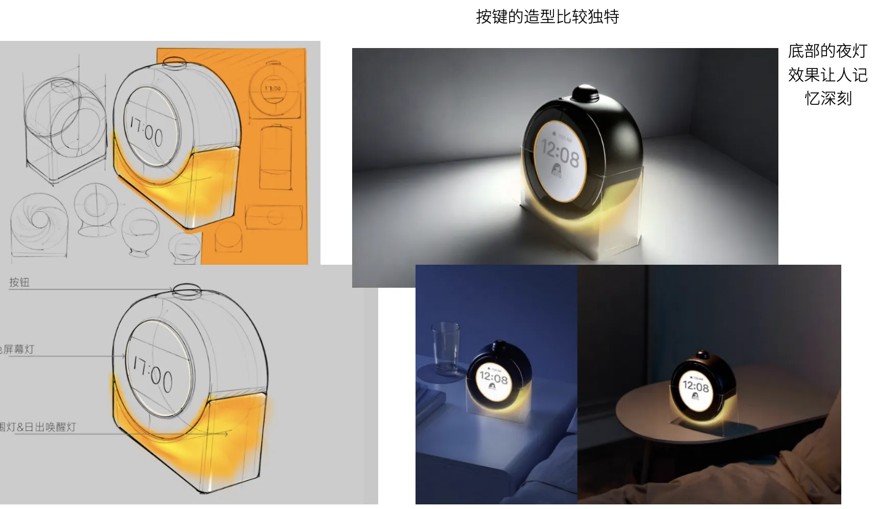
"The bottom night light effect is memorable" — Lighting became the core breakthrough in design language
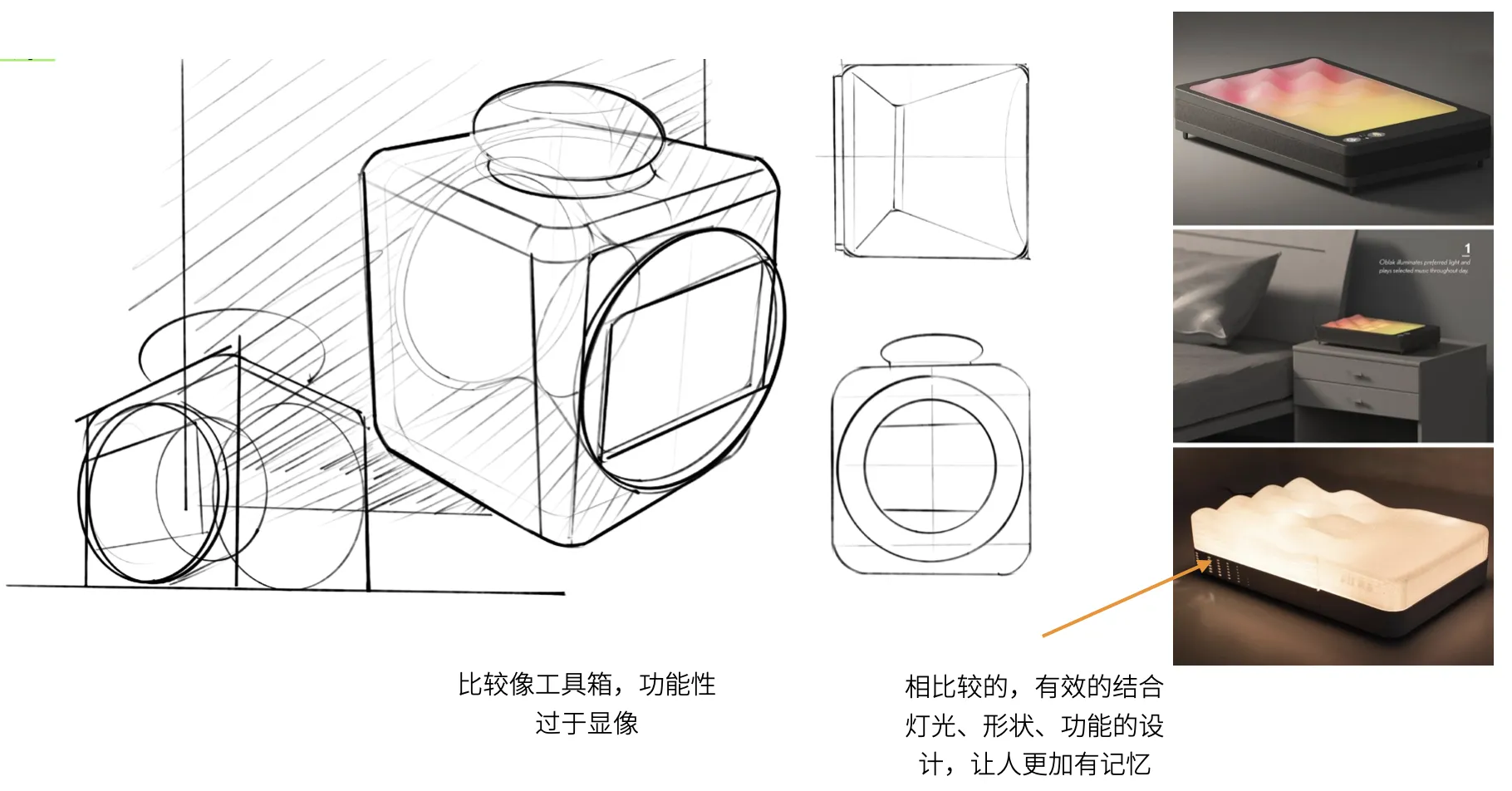
Left: "Looks like a toolbox" — Right: "Effectively combines light, form, and function, much more memorable"
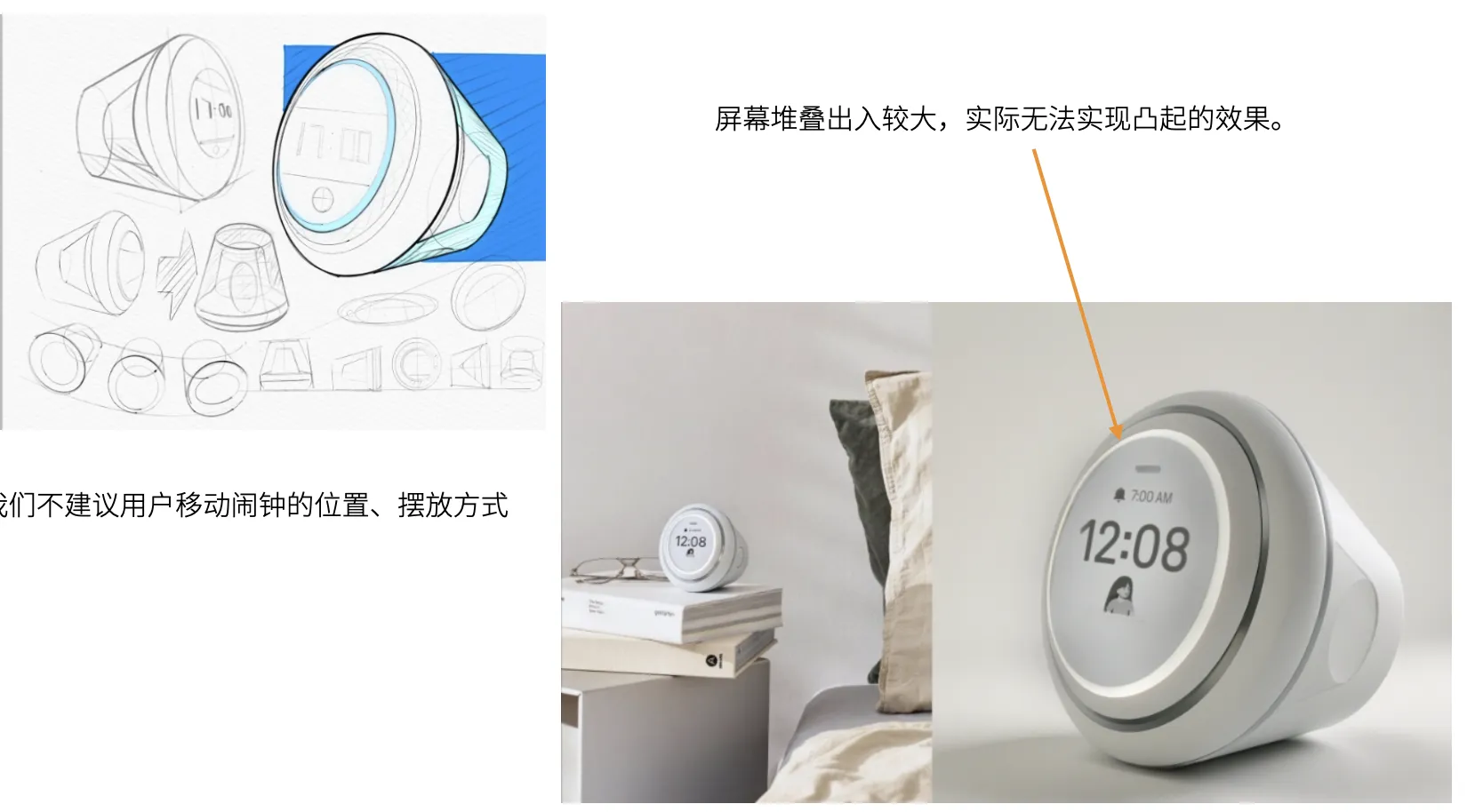
"Screen stack tolerance is too large; the raised effect cannot be manufactured" — Design ideal vs. manufacturing reality
Sleep Science
Our lighting strategy is built on rigorous sleep science — from color temperature to illuminance, every parameter is evidence-based.
Human sleep cycles approximately every 90-120 minutes. Waking atthe end of a sleep cycle (the lightest sleep phase) is the best time to wake up.
Muscles gradually relax, body temperature drops, heart rate slows.
Temperature and heart rate continue to drop. Waking at this stage is relatively easy with low discomfort.
Muscles fully relaxed, breathing steady and regular. Waking at this stage causes severe "sleep inertia."
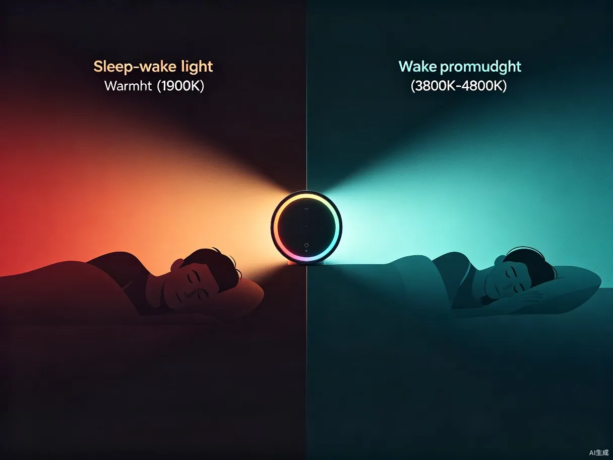
Red & warm white light (1900K) reduces melatonin suppression, helping users fall asleep faster.
Studies show: dynamic sleep-assisting light generates more δ-wave energy compared to darkness.
1900K Warm Color Temp 5 Lux Fixed Illuminance Red × Warm WhiteBlue-green light (3800-4800K) increases melatonin suppression, helping users wake faster.
Morning green light outperforms other wavelengths in suppressing melatonin and adjusting circadian rhythm.
3800-4800K Cool Color Temp Gradual Illuminance Blue-Green × Natural LightDesign Decision: Short-wavelength light (blue/green) significantly suppresses melatonin at night, lowering core body temperature and affecting sleep; while morning green light helps adjust circadian rhythm. Therefore Raychel's lighting system must achieve precise dynamic switching between "pre-sleep warm light" and "morning cool light."
| Product | Price | Design Language | Lighting Feature |
|---|---|---|---|
| Philips HF3500/60 | $59.95 | Minimalist Modern · Natural Harmony | Simulated sunrise gradual light |
| Hatch Rest | $59.99 | Modern Minimal · Child-Friendly | Multi-color night light + Sound machine |
| Lumie Bodyclock Glow | $129.00 | Nordic Design · Warm & Cozy | 30-minute daylight gradual |
| Lexon L'Epure | $49.00 | Minimalism · Pure Geometry | Compact sunrise simulation |
| Nintendo Alarmo | $99.99 | Playful · Gamified · Interactive | Motion sensing + Screen linkage |
| Raychel NODBOT | TBD | Classic · Contained · Unconscious | Scientific twilight light + Motion interaction |
Geometric System
Based on the √2 (≈1.414) dynamic rectangle ratio, the product achieves harmonious proportions reminiscent of classical architecture.
We compared two proportional strategies, ultimately needing to balance portability with presence.
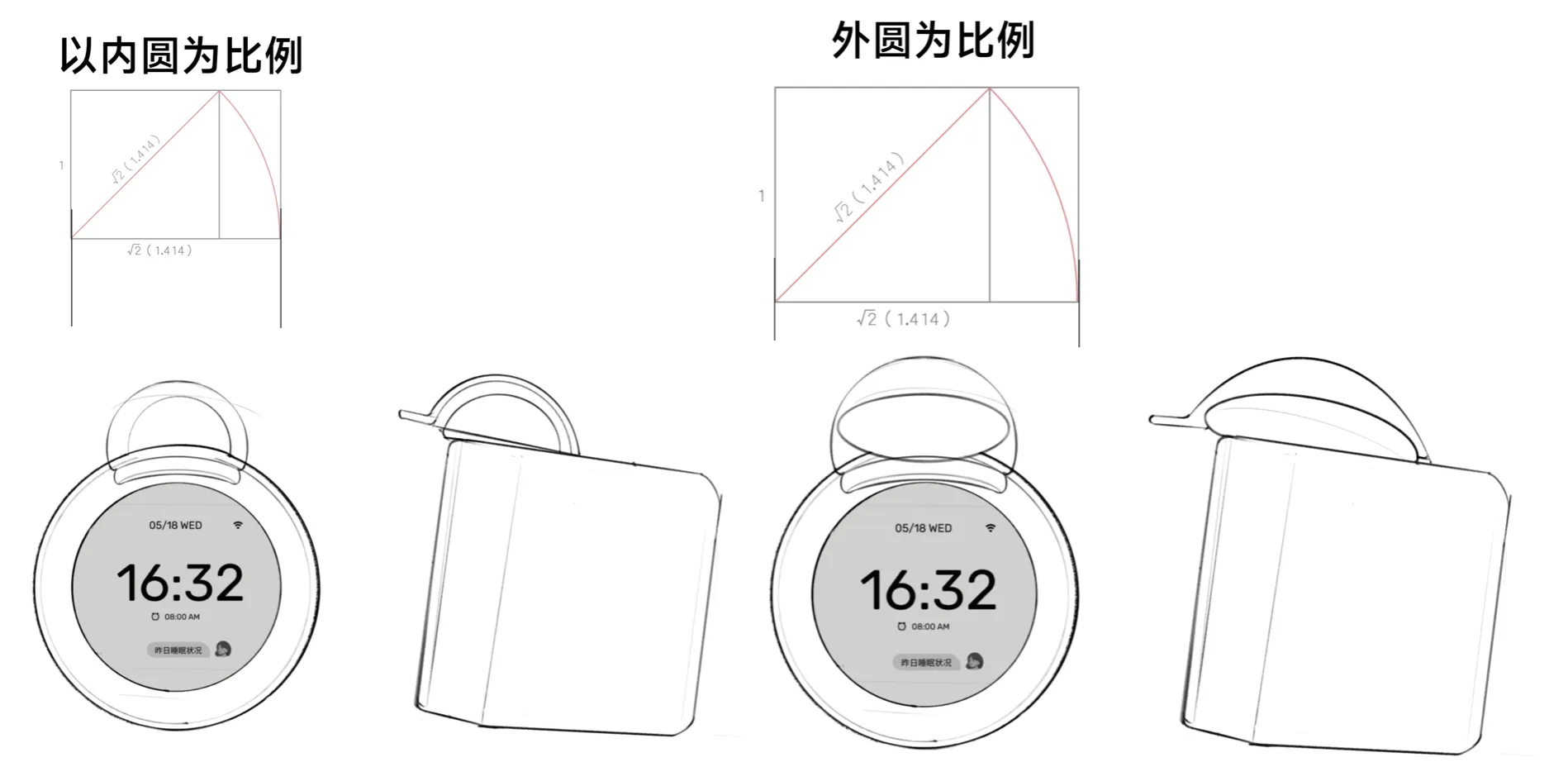
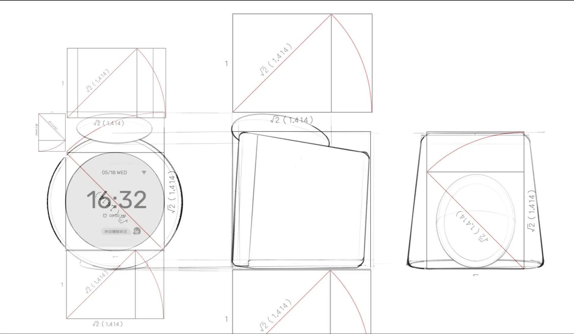
Why √2?The √2 ratio system originates from classical architecture (Le Corbusier's Modulor, Japanese tatami proportions). This irrational number ratio is naturally harmonious with "scale invariance" — when scaled by √2, child shapes maintain the same proportions as the parent.
User & Market
Through innovation diffusion theory and big data semantic analysis, we precisely defined Raychel's target user groups and purchase motivations.
Loves programming, video games, and emerging technology.
Early Adopter Tech ExplorerValues practicality and safety.
Family Decision Maker Gift ScenarioCollege student, eager for change. Easily influenced by content marketing.
Sleep Issues Content DrivenAlarmo's Insight: Nintendo's designers assumed the typical user was "a 10-year-old, smart but lazy, grumpy-in-the-morning child." But the actual user profile is far more complex — 70% are loyal fans, 50% are emotionally-driven buyers. This shows innovative category users are more easily moved by brand and emotional stories than feature lists.
From problem definition to geometric deduction, from design review to sleep science — every step of Raychel points to the same goal: making technology gently "disappear" at night. Not a cold device, but a night companion with breath, warmth, and light.
A design share by NETVERSE DESIGN for NETVERSE LIMITED
Crafted with design rigor and sleep science